My (temporary) Patron Saint of Social Media

Social media bewilders me - how can someone with four posts have 2000 followers? I’d like to blame it on my age, but the need to get eyeballs on your work in order to sell it is a pretty timeless problem. And I’m not alone in wishing there was either a) a magic formula that actually worked or b) someone else to do it for me or c) that I hadn’t avoided it for so long.

Regardless, we are in the age where if my bot doesn’t follow back your bot it’s going to unfollow and get-thin-quick somehow thinks that following a pattern designer is going to… what? I have no idea, but it was probably a bot too.

When this all begins to feel human-less and just odd I look up to the wall over my desk to “young lady of Lyon” who looks perpetually worried about her number of Instagram followers. Since she’s had that look on her face since 1775 I can last a little bit longer.

20181008_115157.jpg

I found her at a nearby charity shop for the princely sum of $10. While I have the academic chops to discuss this print in great historic detail, I bought it because it makes me giggle. I’m going to let her worry about follower counts from here on out. I’ll be over in the corner muttering hashtags to myself.

Following the distraction

IMG_20180923_122627_544.jpg

I’m not exactly sure how - I think a combination of something on Pinterest plus ink pens being in with the watercolor supplies - and suddenly I’m fascinated with the combination of ink and watercolor. Not the usual black line containing color but rather line ends, color caps it off.

I think this will evolve into something far better (eventually) but in the meantime I’m pushing the perfectionist aside and just getting on with making art and putting it out there. A part of me likes the informality of a slight jig and jag in a line (and another part really doesn’t!) I do think there may be potential with current trends towards looking handmade… Digitizing it has it’s own tricks but I’m working it out.

Thoughts? Would you go in a different direction?

flowerilluminationtile2.jpg

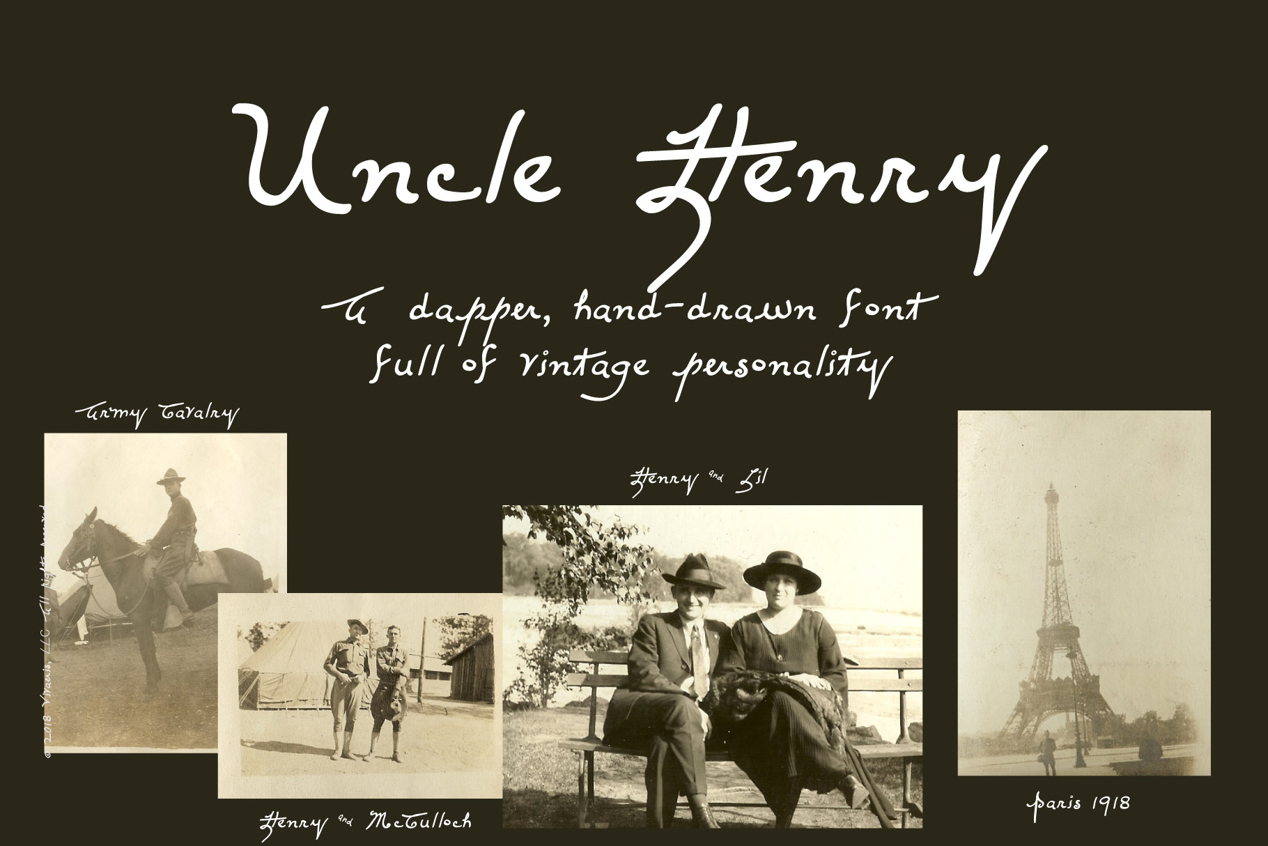
Introducing Uncle Henry

uncle henry hero-1.jpg

My Uncle Henry was a character. A veteran of the Spanish-American War and World War I he claimed to have taught Roosevelt how to use a machine gun (possible and feasible but not verified) and later as a telegrapher in Chicago to have been the one to broadcast the famous moment when Babe Ruth pointed and hit - also not verified, but with the wonderfully plausible cover that he was the one reporting it because nobody else in the press box was paying attention! He went on to become a union organizer and took great pride in getting equal pay for women telegraphers.

He also took great pride in his handwriting, carefully lining even envelopes before writing out the address. This font is based on that handwriting with some modifications to make it work in the modern world.  Most of it is based on a 2-page letter he sent me when I was fifteen and he was in his nineties entitled "Research on Embalmed Mummies".  That pretty much sums up Uncle Henry!

Uncle Henry, the font, will be going on sale next week. I've no idea if it has commercial appeal, but as a labor of love I'm convinced it will find its place, even if its just on family Christmas cards.

Christmas Glitter

jewelsnowflakes.jpg

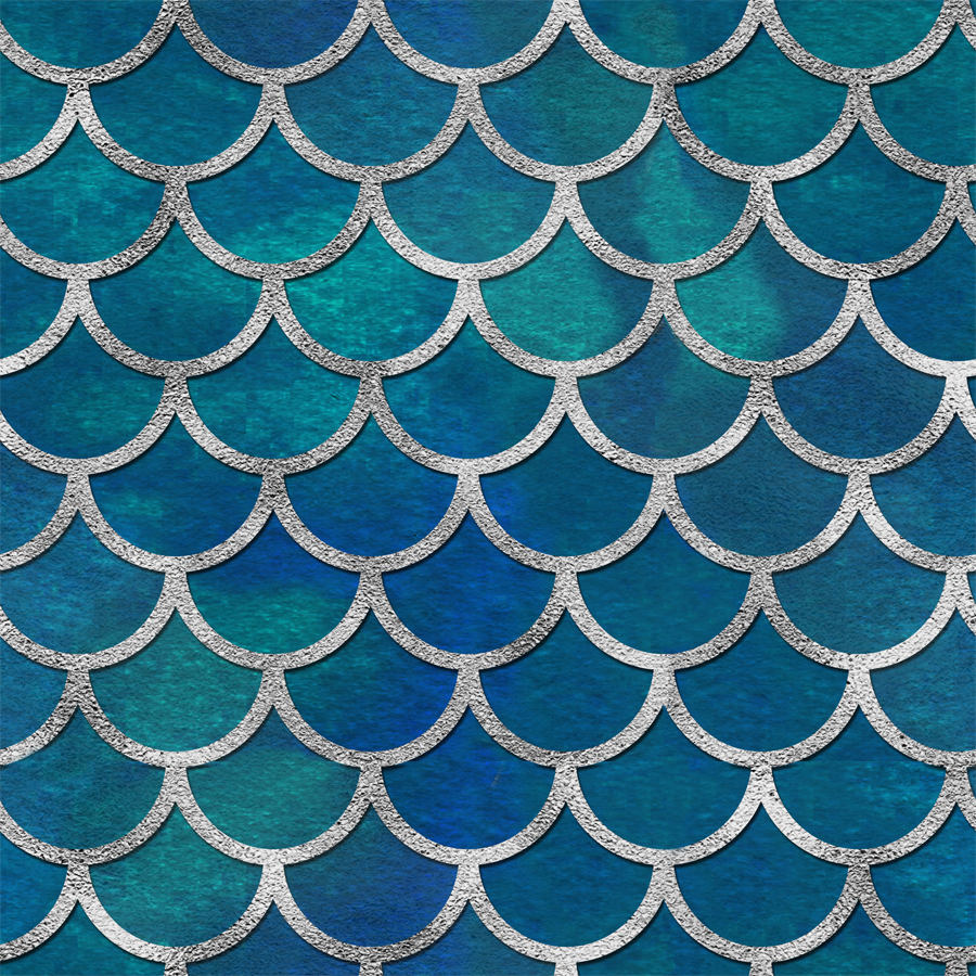
For no particular reason, I've been working on holiday designs these last few weeks. It's just fun to make sparkly, pretty things. I'm not sure what the market is for this right now but perhaps if I put it all on a mermaid...

It's interesting to see what trends are forecasted and how people respond to them in real-life. While I'm not much of a study the trend first and then create, it can be fun to experiment. I did this recently with a small design that was created from an accident and started in black and white. When it came time to apply color I didn't have any strong preferences so went with the current hot color for summer - bright orange. It's proving to be more popular than I expected. I'm not however, going to recolor my entire portfolio into tangerine! Not today, anyway.

Dahlia Delights

dahlia palette.jpg

Ever since the 'beaujolais' dahlias began blooming I've been thinking about using that color palette for designs. So this week I sat down and played with the pinky apricot shades with some hints of lime green. I'm pretty pleased with the results although the main design also represents my computer's limits with Illustrator - just too much shading for it to handle. But they say that constraints are what makes for great design, right?

Since the whole point was the color palette I've only done this in a couple of variations switching out the background color. While it would probably look fabulous in a blue/green variation I don't think the computer is going to cooperate so we'll save that for a pared down variation at some point in the future - or possibly try recoloring in Photoshop...

Back to School fun

For no particular reason I started playing with some office & school supply designs today - namely paperclips. So much fun! Who doesn't love office supplies? And unlike the real thing, playing with digital paperclip chains doesn't mean someone has to undo them before they're useful. Here are a couple of the highlights:


paperclip floral
paperclipgrid.jpg