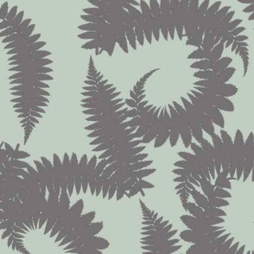
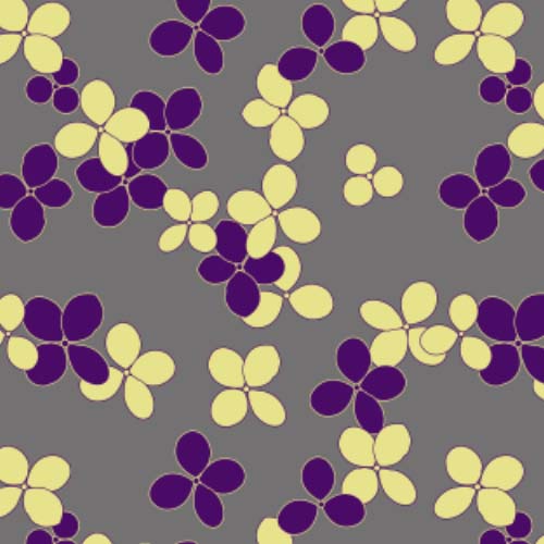
Fiction writers are told to write the book they want to read rather than the one they think will sell. Trends can be a ticket to fame or the best way to get lost in a crowd. When it comes to design, I think the same dynamic applies. I certainly find trends to be an interesting dynamic and a way to add constraints to an open-ended brief. If you don’t have a color scheme in mind, why not explore the new ‘hot’ colors? You can always toss them and do something else if it’s not working.
I have a small upstairs room under renovation that I want to decorate with my own work - but having looked through what I’ve done so far, nothing seemed quite right. So I’ve embarked on a mini project - focusing on five main colors - to create designs drawn from my immediate surroundings and as potential candidates for this cozy little room. It will be the evening snug, the winter hidey-hole with an overstuffed love seat in the dormer, tv and good reading light.
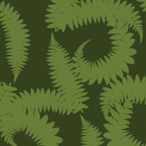
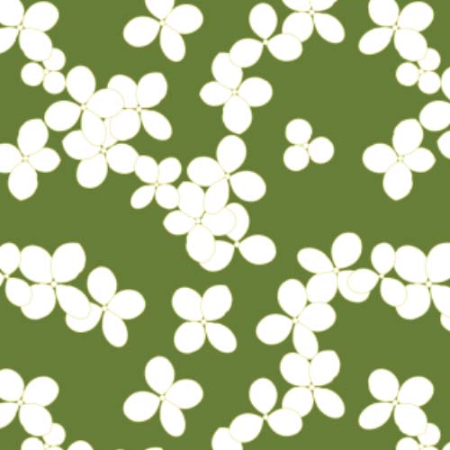
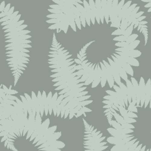
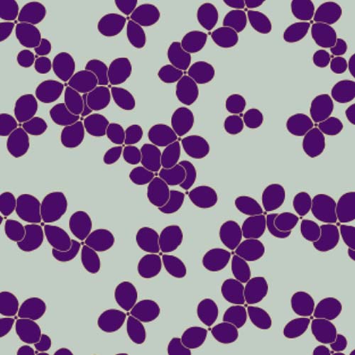
Two of the five colors were dictated by existing upholstery/soft furnishings; seafoam green and gray, the remaining three were drawn from a purple glass vase, a fern and a green/white hydrangea in the front yard. I’m not ruling out white/black or shades and contrasting colors but these five form the main palette.
I want the room to feel like part of its surroundings so I’m focusing on designs that relate to the garden, woods, and landscape. So far I’ve done a simply hydrangea blossom and a fern design. I’m liking this direction and can’t wait to see where I end up!
